Redesigning the onboarding cards for Amazon Business
In 2021, I took on redesigning the content of the onboarding cards (internally called ‘set up’ cards) to make them more clear and engaging. I also crafted a collaborative mechanism to maintain the quality of any new cards introduced. As a result, CTR (Click Through Rate) increased by over 35%.

| Role: | Lead UX Writer |
| Responsibilities: | Content Design and Content Research |
| Collaborators | UX Design, Product, Research, Localisation, and Engineering |
Working at Amazon Business
I worked at Amazon Business as a Lead UX Writer for 2 years. Amazon Business is a B2B version of Amazon.com that caters to small and medium sized corporations, start ups, freelancers and large corporations. typically embedded in squads or teams. I was involved in the research, solution design and localisation of all the projects I was worked on.
The challenge
The set up cards were not performing well. Customer feedback said the process was too confusing. Most said they’d rather have account managers onboard for them instead. However, not all customers have account managers, particularly small businesses.
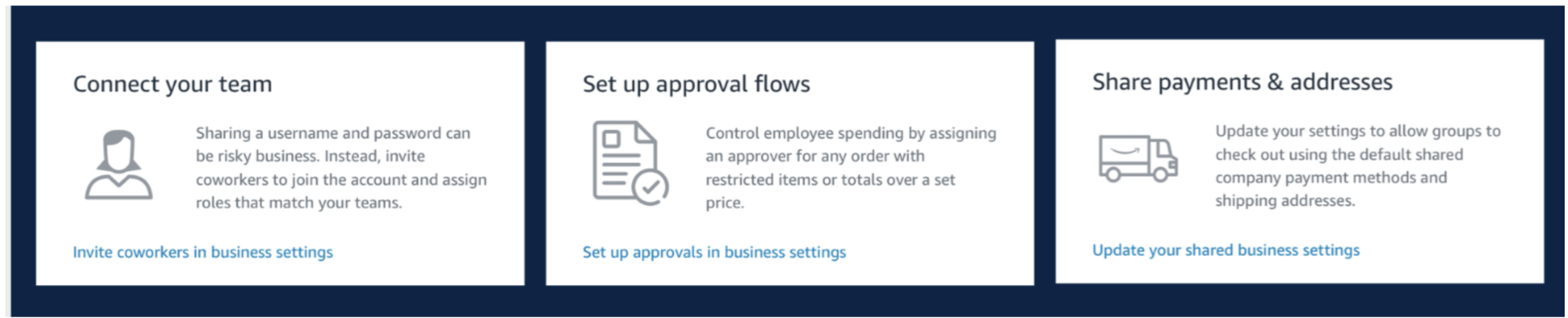
The current set up cards were too long and did not frontload enough contextual information.
The approach
1. Diving into the research
I started by diving into the research that had already been conducted. This uncovered two problems:
The content in the onboarding cards was too long and the card itself was quite large.
It did not frontload contextual information to enable quick actions.
I also looked at a study in 2020 by the Nielsen Norman Group which found:
People don’t read, they scan.
On average, people read about 20% of the text on a page.
They want to pick out information that is most important to their needs.
It did not surface contextual. information and enable quick actions.
2. Uncovering content issues
After looking at the research, I took a closer look at the content in the cards and found:
Inconsistencies in tone and intent. Some cards elaborated on benefit, some had a casual tone, and some were more formal and instructional.
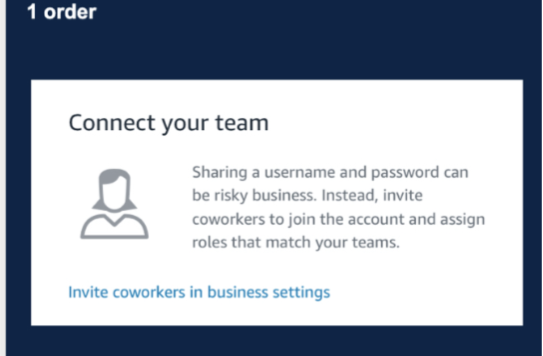
Calls to action (CTAs) were either unclear or had unnecessary details. Some had CTAs like ‘Invite coworkers in business settings’ others simply said ‘See details’ or ‘Quick setup.’
There was no clear owner of the copy. The marketing team, Product Managers, and the UX team had all written copy for these cards over the years.
3. Creating content guidelines and a mechanism to maintain the quality
I worked with the UX designer and PM to create content guidelines. This would establish consistency and improve the customer experience. While teams could write the content for set up cards, they would have to follow the guidelines and go through a quality assurance system where the content is vetted by a UX writer.
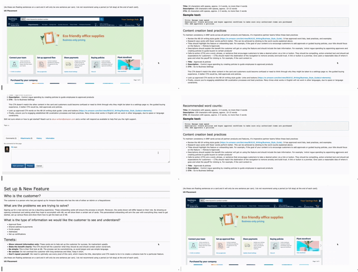
Guidelines included tenets, word counts, and best practices. Here are some of them.
- Tenets
Show relevant information only.
State the benefit clearly.
Be simple.
Be concise.
- Recommended word/character counts
Title: 20 characters, 2-4 words
Description: 100 characters,10-15 words
CTA: 20 characters with spaces, 2-4 words
There were inconsistencies in tone. Some CTAs had too many details.
4. Reworking the copy
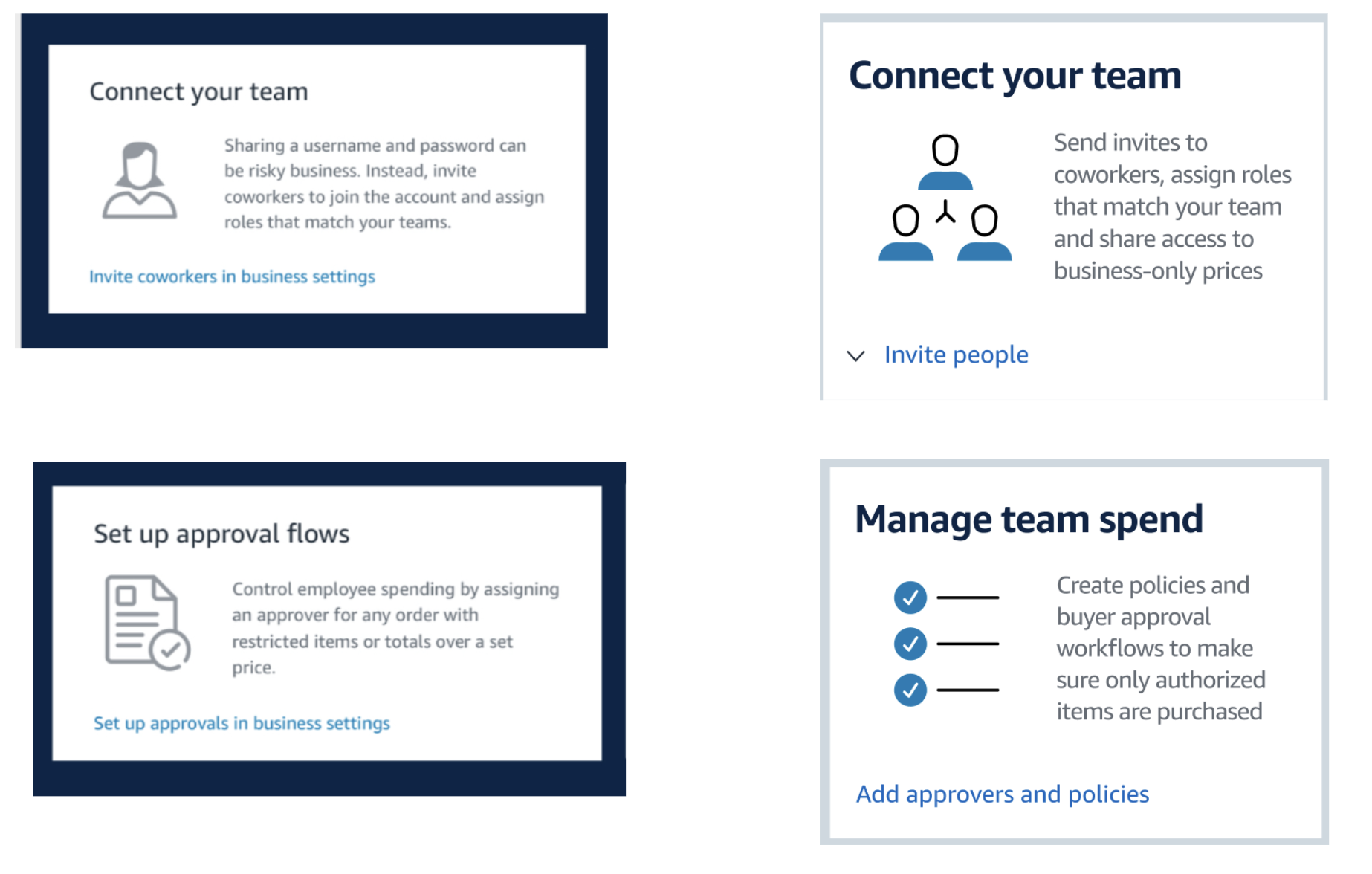
I started redoing the copy for the existing cards according to the guidelines. The primary goal was to make tone consistent, clean up the CTAs and state the benefit clearly and concisely.
Content guidelines that included tenets, word and character counts along with best practices.
5. Making localisation easier
Text expands by 20 - 50% depending on the translated language. To avoid lengthy translations, I explored a mechanism with the localisation manager to ensure translations were easy to do.
This was done by:
Highlighting the main intent of the English sentence, so that those parts are definitely translated.
Providing additional context to English words to avoid confusion (for e.g. authorized could also mean approve, common could also mean shared)
The old copy
The reworked copy

The impact
Increase in engagement: Data collected showed the Click Through Rate increased by more than 30%.
Consistency: The content guidelines and quality checks ensured there was consistency in the language used in any future cards created.
An example of how the localisation mechanism